
Typography
Our words are important—but so is the way in which we display them. Using appropriate typefaces helps to set the right tone and strengthen the Westminster brand. For external audiences, please use official Westminster typefaces or recommended alternatives.
Our primary san serif typeface is Whitney. It is used to project a clean, modern feel and is easily readable in a variety of applications. Note: Whitney Book is our default font for body copy.
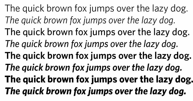
Suggested uses: Whitney Book or Whitney Medium for body copy; Whitney Semibold or Whitney Bold for headlines.
Versions available: Book, Book Italic, Medium, Medium Italic, Semibold, Semibold Italic, Bold, Bold Italic
How to access: Paid font (request license from Marketing Office)
Alternate typeface: Calibri (pre-installed in Microsoft suite), Open Sans (free download from Google Fonts)
Westminster owns a limited number of licenses to the Whitney typeface. If you make pieces for an external audience and need access, please email the Office of Marketing & Communication at marketing@westminster.edu. Otherwise, please use one of the recommended alternate typefaces in its place.
Open Sans is free to download from Google Fonts.
Our primary serif typeface is Century Old Style. It should be used to convey a classic collegiate feel and works best in formal settings.
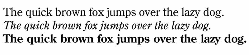
Suggested uses: Century Old Style Regular for body copy; Century Old Style Bold for headlines.
Versions available: Regular, Italic, Bold
How to access: Adobe font (CC login required)
Alternate typeface: Georgia (pre-installed in Microsoft suite)
Century Old Style is an Adobe Font, and can be accessed by anyone with a current Adobe Creative Cloud subscription. If you make pieces for an external audience and need access to Adobe, please submit a Help Desk ticket. Otherwise, please use one of the recommended alternate typefaces in its place.
Our display font is Bebas Neue. It is meant to capture attention, and should always be used in bold and all capital letters.

Suggested uses: Bebas Neue for headlines.
Versions available: Free version only available in Bebas Neue Bold.
How to access: Free download from Google Fonts
Alternate typeface: n/a
Bebas Neue is free to download from Google Fonts. The full Bebas Neue family (Bebas Neue Pro) is available to those with Adobe Creative Cloud access.
We recommend using no more than two typefaces per page/project for readability and to ensure that your message comes through.
When using Whitney Book, bold items should appear in Whitney Semibold; when using Whitney Medium, bold items should appear in Whitney Bold.
Not every project must use official Westminster fonts. For internal audiences, feel free to use what you would like. It is for projects and communications intended for external audiences that we want to take care to use a consistent look.
When you have found the font you'd like to download, click on "Get Font" or "Download Font." A zip folder will appear in your downloads. If you need to unzip the folder, double click (on a Mac) or right click and select "Extract All" (on a PC). Locate the .ttf or .otf file in the folder and double click on it. A pop up will appear; click on "Install" to complete the download and add the font to your font book.
Note: You may have to restart your program in order for the newly-downloaded font to appear.